@JasonL At the time I reported this, that field was locked too, so it couldn't be edited — but I've now confirmed that it's editable.
L
LEE JONG GUN
@LEE JONG GUN
Posts
-
-
@JasonL Thanks for the update, and for getting this fixed.
One follow-up: now that
_copyis auto-appended, the resulting code can
exceed the 12-character limit, and in that case the clone still can't be
saved. For example, a code that's already 8+ characters will go over the
limit once_copyis added.Ideally, the code field should be editable during the clone step itself,
so the user can set a valid, unique code up front rather than relying on
an auto-generated suffix that may already break the length limit. -
@Paul-Winterhalder Sorry, I think I uploaded the wrong screenshot earlier, which may have
caused some confusion.Import isn't really my main use case — export is what I need most.
I regularly analyze a specific user's backup history, and being able to
bulk export that user's Custom Entities directly from the User tab would
make that workflow much smoother. Right now I have to go through the
Global tab to do any bulk operation, even when I'm only looking at one
user's data. -
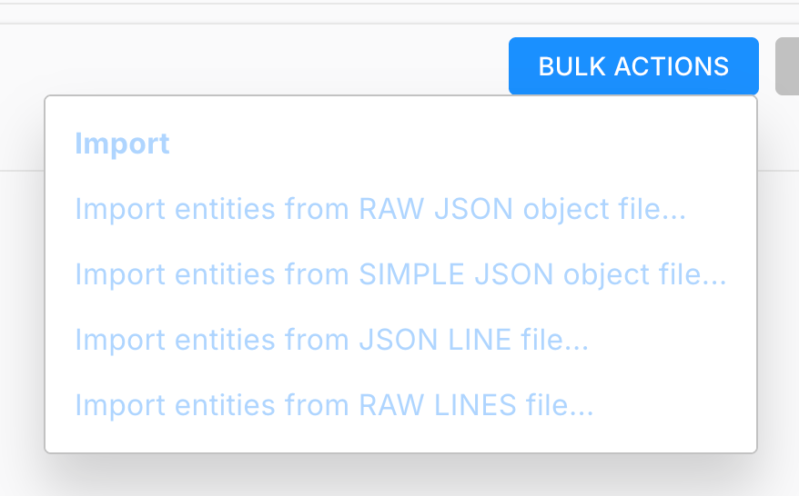
Hi team,
I'd like to request a usability improvement for Custom Entities in the Design portal.
Currently, when I access a player's Custom Entities through the User tab (User Monitoring > Custom Entities for a specific user), there are no bulk actions available. To perform bulk operations on Custom Entities, I have to go to the Global tab instead.
It would be really helpful if the same bulk action functionality available in the Global tab could also be added to the User tab. This would let us manage a specific user's Custom Entities much more efficiently without switching contexts.
Thanks for considering this!
-
Hello
A "code" field was recently added to Segments. When using the Clone function, the code is also carried over (copied as-is) into the cloned segment, which prevents the clone from being saved.
Since the code value should be unique, the cloned segment ends up with a duplicate code and cannot be saved.
-
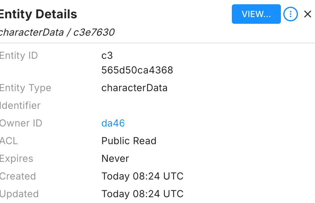
Hi team,
In the BrainCloud portal, when viewing a Custom Entity and clicking on the Owner ID, the page navigates away from the current entity view immediately. This is inconvenient when I want to quickly check the owner's profile while keeping the entity I was inspecting open for reference.
Previously, you added an "Open in new window" option for player entries in the Leaderboard list, which has been extremely helpful for cross-referencing data without losing context. It would be fantastic if the same "Open in new window" option could be added to the Owner ID link in the Custom Entity view as well.
This small addition would significantly improve the workflow when investigating user data and debugging issues across multiple entities.
Thanks!
-
Symptom
After updating from 5.9.2 to 5.9.3, iOS/iPadOS experiences gradual performance degradation during extended play sessions, eventually leading to app termination
This issue did not occur on 5.9.2
Suspected Code
In BrainCloudComms.cs - HandleResponseBundle, the following line was added in 5.9.3:jsonData = JsonWriter.Serialize(JsonReader.Deserialize(jsonData));
Concerns
This performs a full deserialize → reserialize on every API response
Immediately after, DeserializeJsonBundle parses the same data again — effectively parsing every response twice
Each response generates a large number of temporary objects (Dictionary, List, boxed values, strings) that are immediately discarded
On iOS with IL2CPP (Boehm GC), could this repeated allocation/deallocation pattern cause managed heap growth over time?
Question
Could this code potentially contribute to memory-related issues on iOS during extended play sessions? -
@Michael-Costa
The second option seems too narrow in scope for us, since it would
require us to apply it individually to each affected field, which
is not very practical in our case.With the first approach, the raw response is now being normalized
back to the same format we were seeing in 5.9.2, so we will proceed
with that as our workaround for now.Thank you
-
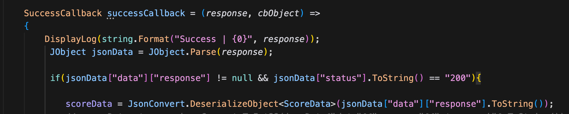
    string responseData = JsonParser.GetString(response, "data", "response");
        if (!string.IsNullOrEmpty(responseData) &&    JsonParser.GetValue<int>(response, "status") == 200){

            ScoreData3 scoreData = JsonReader.Deserialize<ScoreData3>(responseData);
            Debug.LogError(scoreData.stage_rank); >>WORKING
            Debug.LogError(scoreData.tier);>>WORKING
We tested using the method you suggested, and with that approach
the double values started coming through as integers correctly.However, another issue appeared because we are using Obscured
Values in our project.When deserializing classes that contain Obscured types, those
fields are not converted correctly with this method.The error we get is:
InvalidCastException: Invalid cast from 'System.String'
to 'CodeStage.AntiCheat.ObscuredTypes.ObscuredString'.If we switch back to using a JsonConverter, the original double
problem happens again.Currently we resolve the Obscured type conversion using:
JsonConvert.DefaultSettings = () =>
new JsonSerializerSettings {
Converters = { new ObscuredTypesNewtonsoftConverter() }
};So my question is: does JsonReader provide a way to apply a
converter globally in a similar way, like JsonConvert.DefaultSettings? -
The error we are seeing is:
JsonReaderException: Input string '4.0' is not a valid integer. Path 'tier', line 2
I tried the approach you suggested.
I parsed the response with JObject first and then
deserialized it again using JsonConvert.DeserializeObject.However, the error remains the same.
JsonReaderException: Input string '4.0' is not a valid integer.
It appears that the raw response value is already coming
through as a double (e.g. 4.0). When Newtonsoft.Json tries
to deserialize it into an int field, it fails.So simply passing the response through a
serializer/deserializer step does not seem to resolve the
issue in this case. -
@Paul-Winterhalder Thanks for the clarification.
At the moment, I have not finished retesting everything yet
because I am handling several other tasks in parallel.
However, to give you an accurate answer, I am currently
reinstalling and testing again on 5.9.3.For reference, this issue is not occurring with LitJson on
our side. The deserialization error is happening with
Newtonsoft.Json.JsonConvert.More importantly, the root problem is not just which JSON
library is being used. The actual issue is that the raw
response itself is already coming through differently.
Before, this value came through as an integer, but in 5.9.3
it is coming through as a double-form value such as 7.0.So from our perspective, the problem starts at the raw
response level, before deserialization into our class. -
Ok I will try Thank you!
-
There are multiple leaderboards in the game separated by region, but aside from the region itself, they all use the same settings.
When creating them initially, cloning works fine. However, after they have been created, if I need to adjust various options, I have to edit each leaderboard one by one.
The main problem is that every time I save a change, the “Updated successfully” popup appears and covers the edit button, which makes consecutive edits across multiple leaderboards very inconvenient.
It would be much more efficient if there were a way to edit multiple leaderboards with identical settings at the same time. At the very least, moving the success popup to a location where it does not block the button would greatly improve usability.
-

When updating multiple leaderboards consecutively, the current UX becomes quite inconvenient.
Each time a leaderboard is updated, an “Updated Successfully” popup appears. The issue is that this popup shows up in the top-right area, which is also where the Edit buttons and most of the controls are located.
Because of this, the popup covers the edit buttons, and instead of continuing the workflow, the user has to close the popup first before editing the next leaderboard. When several leaderboards need to be updated in sequence, this becomes unnecessarily repetitive and slows down the process.
It would significantly improve usability if one of the following changes could be considered:
Move the success notification to a less intrusive location (for example, bottom-right or top-center of the screen).
Make the notification non-blocking, so it does not cover important UI elements.
Add the ability to edit multiple leaderboards at once, instead of updating them one by one.
Currently, since most of the actionable UI is concentrated in the top-right corner, displaying notifications in the same area creates unnecessary friction for tasks that require repeated edits.
This small UX change would make managing multiple leaderboards much more efficient.
-
Environment:
Unity (C#)
BrainCloud SDK 5.9.3 (upgraded from 5.9.2)
Issue:
After upgrading to BrainCloud SDK 5.9.3, integer values from cloud code script responses are converted to floats before being passed to the success callback.Details:
The server-side cloud code script explicitly assigns integer values: var tier = 7;
The server JSON response correctly contains "tier": 7 (integer)
Before SDK 5.9.3: The callback received "tier": 7 (integer, as expected)
After SDK 5.9.3: The callback receives "tier": 7.0 (float, unexpected)
The SDK internally parses and re-serializes the response (likely related to the new JsonParser introduced in 5.9.3??), converting integers to floats in the process
This breaks JsonConvert.DeserializeObject<T>() when the target field is int, throwing: JsonReaderException: Input string '7.0' is not a valid integer
Only affects custom values set in cloud code scripts. BrainCloud's own API values (e.g. rank, score) are not affected.
Expected Behavior:
Integer values from cloud code scripts should remain as integers in the callback response string, same as SDK 5.9. -
@Paul-Winterhalder Now, purchase validation proceeds normally regardless of the “Use App Store Server API for legacy receipts (optional)” option setting.
-
@Paul-Winterhalder Yes, that’s correct. It is a sandbox account.
After the patch, it would be good if existing receipts continue to work by default.
-
Hello
Project 14594
Tester ID 1b5c9fce-a890-4d86-86aa-dd71263d0fc1App Store \Server API has been fully configured in the current BrainCloud settings, and “Use App Store Server API for legacy receipts (optional)” is turned OFF.
This option must be disabled for the legacy receipt flow to function, so it is intentionally kept turned off in order to use the current setup.When checking Verify Purchase in the user ID logs, the client has not yet been updated, so it is not sending a transactionId and is instead sending the receipt, following the legacy receipt-based flow.
-
"packetId": 13,
"responses": [
{
"data": {
"resultCode": 101,
"errorMessage": "Transaction id not found.",
"store": "itunes"
},
"status": 200
}
]
}After configuring the App Store Server API, enabling “Use App Store Server API for legacy receipts (optional)” appears to cause legacy receipt validation to stop working. Instead, the system starts requiring a transaction ID.
In other words, checking it has the opposite effect.
We are currently running a live service using the existing receipt-based flow, so we have this option turned off—meaning we are effectively using it in practice (because enabling it breaks legacy). We are very concerned that if this behavior gets “fixed” later, it could cause issues in our live service. Please take this into account and ensure any patch/change does not introduce regressions for live operations.
Segment Code Bug Report
Segment Code Bug Report
[Feature Request] Bulk actions for Custom Entities in the User tab
[Feature Request] Bulk actions for Custom Entities in the User tab
Segment Code Bug Report
[Feature Request] Add "Open in New Window" option for Owner ID in Custom Entity view
Newtonsoft.Json fails to deserialize integer fields after BrainCloud SDK upgrade 5.9.3
Newtonsoft.Json fails to deserialize integer fields after BrainCloud SDK upgrade 5.9.3
Newtonsoft.Json fails to deserialize integer fields after BrainCloud SDK upgrade 5.9.3
Newtonsoft.Json fails to deserialize integer fields after BrainCloud SDK upgrade 5.9.3
Newtonsoft.Json fails to deserialize integer fields after BrainCloud SDK upgrade 5.9.3
Newtonsoft.Json fails to deserialize integer fields after BrainCloud SDK upgrade 5.9.3
Request: Improve Leaderboard Editing UX (Success Popup Blocks Buttons)
Request: Improve Leaderboard Editing UX (Success Popup Blocks Buttons)
Newtonsoft.Json fails to deserialize integer fields after BrainCloud SDK upgrade 5.9.3
Are there plans to support Storekit 2 receipt verification?
Are there plans to support Storekit 2 receipt verification?
Are there plans to support Storekit 2 receipt verification?
Are there plans to support Storekit 2 receipt verification?