Portal-X is now available to all Public BaaS. Any feedback?
-
Hi folks,
In case you didn't realize - all Public BaaS users (i.e. everyone connecting via portal.braincloudservers.com) now has access to our next-generation portal, Portal-X, via portalx.braincloudservers.com.
We are interested in your feedback!
Tell us what you like and don't like. We will be iterating quickly over the coming months - and want to ensure the best experience possible for the launch of brainCloud 5.
Thanks a bunch!
Paul.
-
Hello,
I've already mentioned this with the support but i'll post that here too. I think the cloud code needs to become a bit more frictionless just like the legacy cloud system when it comes to editing/saving scripts.
Ideally, i'd want to be able to edit scripts without clicking the edit button but rather justclickingtyping inside the script.
Also saving the script without losing 'sight' of the script if that makes sense (Without the loading transition animation so i don't 'space out' cause even when i'm saving i'm still looking at the code. Kinda like the legacy system was in that aspect)
And more style configurations for the cloud code which as far as i'm aware, that's already planned? -
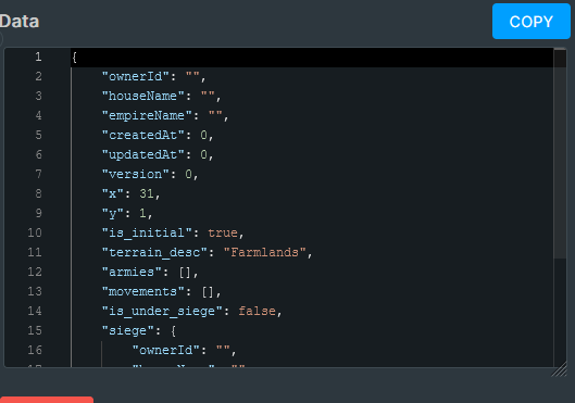
@paul-winterhalder Follow up on the upper comment, i think the entity view also needs to become a bit bigger. While the entity editing is a great improvement over the legacy system, the window for viewing the entity is too small
-
@panagiotis-milios Sorry for the slow responses!
Ideally, i'd want to be able to edit scripts without clicking the edit button but rather just clicking typing inside the script.
We are looking to see what can be done to reduce the friction here. It's a bit of a balancing act between:
- allowing multiple code windows (but only one editing session at the time)
- managing edits to the code vs meta-data of a script
- ensuring that changes are saved before running scripts... (as our servers require the code to be committed first).
We are working on it though - cause we agree that the extra [Edit] button clicks can be annoying.
Also saving the script without losing 'sight' of the script if that makes sense (Without the loading transition animation so i don't 'space out' cause even when i'm saving i'm still looking at the code. Kinda like the legacy system was in that aspect)
- Also something that we're working on.
And more style configurations for the cloud code which as far as i'm aware, that's already planned?
We're looking to see what can be done in this area. We're using the new Visual Studio-based Monaco editor - and we're a bit surprised that it doesn't more easily support switching of the themes and stuff. (And also seem to support an older theme system than Visual Studio itself).
Anyway - hoping to deliver on this in coming releases.
Thanks for the feedback!
Paul.
-
@panagiotis-milios said in Portal-X is now available to all Public BaaS. Any feedback?:
@paul-winterhalder Follow up on the upper comment, i think the entity view also needs to become a bit bigger. While the entity editing is a great improvement over the legacy system, the window for viewing the entity is too small
For this comment - which entities are you referring to? Global Entities? User Entities? Custom Entities?
Would it be possible to attach a screen shot so we get a better feeling for which size your are referring to?
There's a side panel that allows you to quickly view the entity. It is designed to be resizeable. And then there is a pop-up window for editing the entities. Those are a decent size - with a separate tab for editing the json.
We're fixing a bug for [I think] Global Entities where the json portion wasn't filling the entire tab pane... but I think the other editors are fine in that regard.
Just want to ensure that you aren't referring to something different?
Paul.
-
@paul-winterhalder Hello,
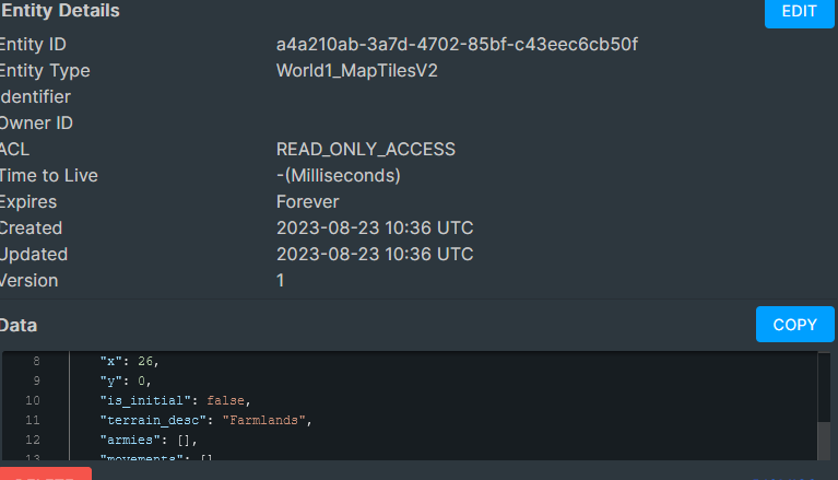
I was referring to Custom Entities, specifically on the side panel. If i am correct, It is resizeable only horizontally. Ideally, i'd like the data part to occupy more space vertically. If possible, could you perhaps make the Entity Details part of the window minimizable so the data part can take over that space.
The pop-up window for editing the entities is great and a nice upgrade of the legacy system.
Also, could you add some colored texts in Job Status (In job queue Window). Green for Success, Blue for Scheduled, Red for failure & Orange for cancelled perhaps? (I'm using the dark mode, i don't know if that would make sense in the light mode)
-
-
@panagiotis-milios Hmm - there is an expander corner in the bottom-right of the text box - but you are still limited to the available real-estate of the display.
We could maybe discuss with the devs being able to slide the json up - covering some of the meta-data for the object...
We'll look into it. @Corey-Clarke ^^^
-
@Paul-Winterhalder Just testing that I can reply here. We've heard reports!
-
@Paul-Winterhalder I think the expander in the bottom right did not exist in 4.15 when i reported it. It can be seen from the image as well. Version 5.0 has vastly improved the entity viewer. For comparison with the previous image i posted, i'm attaching an image from how i see it now

The script saving has become better without the transition animation. Also ideally, i'd like to use CTRL+S to save scripts.
Also, could you perhaps increase the gaps between job property fields a bit to the Job Queue window (Scheduled time, Creation time, Type etc...) and maybe add some colour codes for job status?
-
Hi @Panagiotis-Milios ,
Yup - we made improvements to the Entity Viewer(s) partially based on your feedback. There are more improvements to come as well.
We're also looking at the Job Queue screen - and I've passed the Ctrl-S request onto the Cloud Code Editor dev... I definitely agree with that - it's a reflex for lots of folks (including me!).
Paul.

