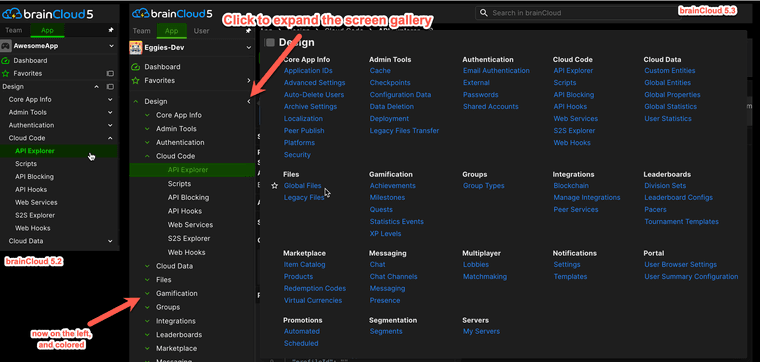
brainCloud 5.3 is live! Do you like the updated UI?
-
Hi folks!
brainCloud 5.3 has dropped - and has a bunch of new and updated features.
We certainly hope you like them all!
That said - I'm especially interested in what folks think of:
- The updated Context Bar at the top of the screen (with more useful Team, App and User info)
- The new User Menu and User Unlock feature.
- The new Product Analytics and Product Transactions screens.
Do you like the changes? Are we [hopefully] moving in the right direction? Any feedback on any of the other features?
Here is your chance to help shape the direction of the brainCloud developer experience!
Paul.
-
I've only encountered #1 for now, but I like it

-
The new user menu is much better. Also did you add colors to the side bar. It visually feels smoother but i'm not sure why.
-
I have noticed when using the sorting options in User Browser->Credentials->Sort by Type, that the list seems to not sort if there are more credentials that the page. It looks like it isn't clearing out some of the listed credentials when sorting and the list of 'Anonymous' seems to grow.
-
@Panagiotis-Milios said in brainCloud 5.3 is live! Do you like the updated UI?:
The new user menu is much better.
Thanks!
Also did you add colors to the side bar. It visually feels smoother but i'm not sure why.
There were some subtle changes made to the bar. The expand / collapse controls were moved to the left-hand side -- to better distance them from the "screen gallery callout" (the real name escapes me - I'm sure the designers will correct me
 ) that appears on top-level menus.
And yes - we've added colors to those controls as well.
In general, there are few needless screen refreshes happening when you navigate the system - so that should make everything feel smoother.

-
@Brad-Hester said in brainCloud 5.3 is live! Do you like the updated UI?:
I have noticed when using the sorting options in User Browser->Credentials->Sort by Type, that the list seems to not sort if there are more credentials that the page. It looks like it isn't clearing out some of the listed credentials when sorting and the list of 'Anonymous' seems to grow.
Do you mean the Credentials section of the User > Summary > User Summary page?
Certainly some users will have more than one Anonymous ID (technically - one for every device they've played your app on). By default we sort so that Anonymous IDs are at the bottom of the list (they are the least important form of credential).
The list seems to be "growing" for you?
-
@Paul-Winterhalder I will send a video to you, as it contains some private user data for the example, thanks!
-
Ah - thanks for the video @Brad-Hester - there is indeed a bug there. We are preparing a fix!
-
@Brad-Hester That bug has been fixes (and patched). Thanks for reporting it!
