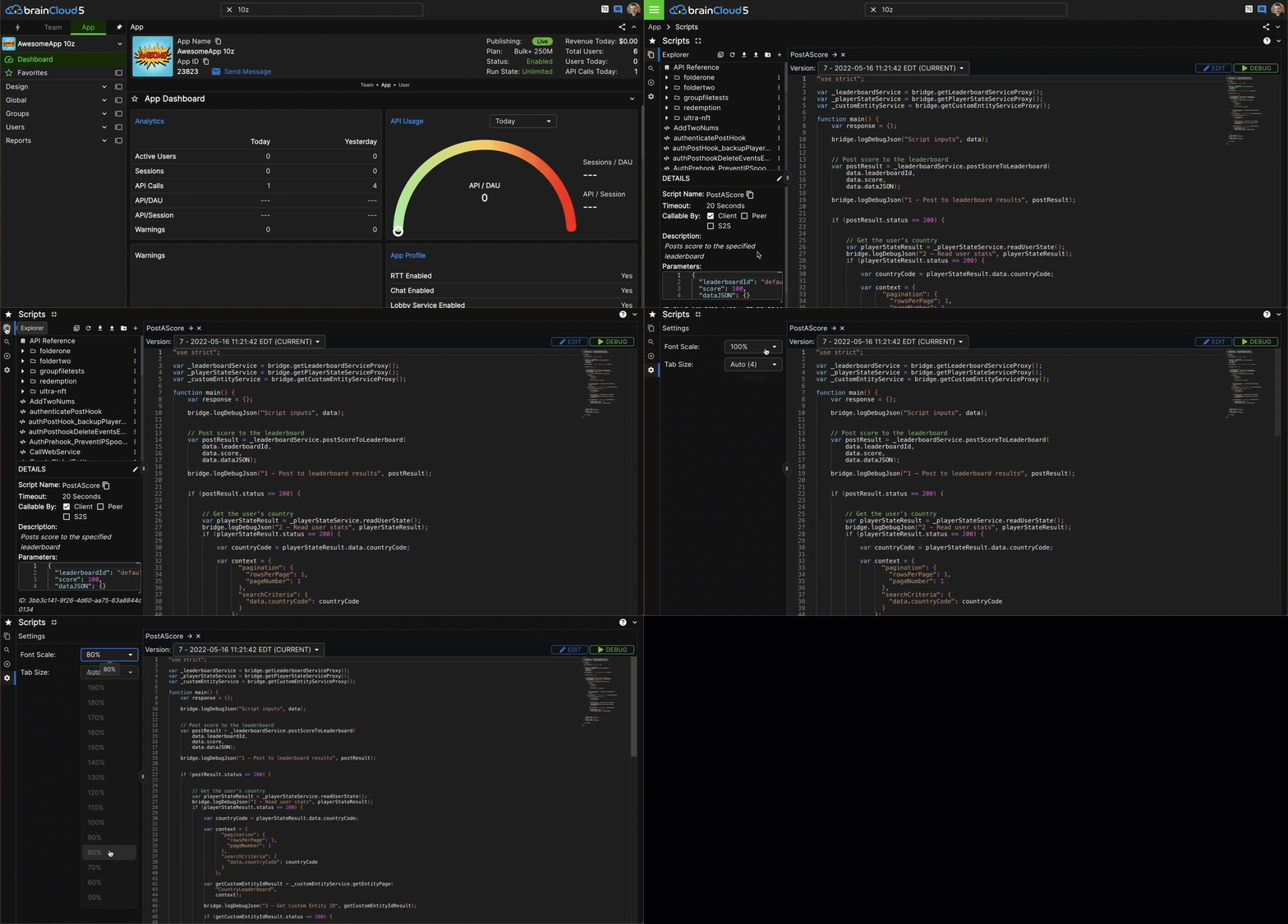
Coming in brainCloud 5.2 - refactored Script Editor!
-
Hi,
We've redesigned our script editor again to be more useful for folks with smaller (i.e. laptop) screens.
This is coming to our Public BaaS next week as part of brainCloud 5.2!
We hope you like it.
Paul.

-
No comments on the updated layout?
Like? Dislike?
-
I have a pretty large screen so i didn't see any difference in 5.2. But from the above gif, i just realised the existence of the menu on the left side of the cloud code editor.
I mean this (Unless it was added in 5.2 which then it's great)

For debug, i was just using the button on top right.
I think you should apply some color to the images of the above menu as well as the one in the image below to add some emphasis.

Also, the font scale as well as tab size for the cloud code editor are great options that didn't know they existed
-
Hi Panagiotis,
Thanks for the feedback!
That vertical icon bar on the far left is new in 5.2. It was key to allowing us to free up more space - moving the Debug + Log screens to their own pane. (i.e. now the screen is only ever split vertically in 2 - instead of sometimes split into 4 pains - 2 verticle and 2 horizontal).
The font scale and tab size options were there before too - but are somewhat more discoverable now that we have that cog wheel.
Glad you like the changes!
